It’s been a few months since we launched the flagship feature of our current application: Panel View. The goal of Panel View is to give primary care providers (PCPs) high-level visibility across their patient panels to quickly and easily identify who is most likely to need attention. The Pearl Platform analyzes data across the patient panel to give PCPs a simple, yet powerful heatmap to visualize risk, forecast need, and enable a more proactive approach to patient care.
For those of you who are unfamiliar with software development, we have the luxury (and challenge) of “launching and learning.” My job as a Product Manager is to take those real-time learnings and work with our design, data science, and engineering teams to continuously improve the application.
In this post, I elaborate on this process, how it has been employed to launch and rapidly improve Panel View, and what you can expect to see from Panel View in the months ahead.
Our Process
We try to get an experience into users’ hands as quickly as possible to then iterate based on feedback. One of my favorite Product Management quotes is: “If you think it’s great, you waited too long to release it.”
Panel View will be a feature you’ll see us continuing to improve over months and even years. Some of these updates will be big changes, like adding a new data source, and others will be minor tweaks in our algorithm to prioritize patients. Every time a practice engages with our technology or talks with us, they contribute to our own prioritization decisions as we define our product roadmap.

How Our Clients Help Us
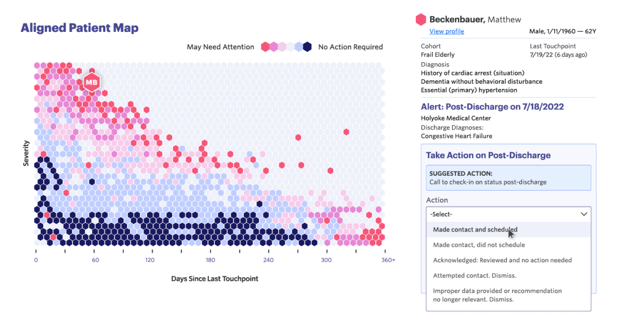
Since Panel View launched in late Q2, our team has been eagerly watching our practices take actions (or “flip hexes”) in the platform. In Panel View, each patient is represented by a hexagon, plotted on a simple chart. The x-axis represents the last time the patient was engaged by the practice; the y-axis represents the severity of the patient’s clinical conditions. The warmer the color of the hexagon, the more likely it is that the patient needs attention. For example, a deep red hexagon implies that a patient may be in need of attention, signaling the practice to check in with the patient.
Some of the most rewarding moments at Pearl are when we see that our technology has helped a practice catch a patient who may have been falling through the cracks of the healthcare system.
With that in mind, we also take it seriously when practices offer feedback on how our technology could better enable them to deliver proactive care for their patients. Several of these insights have contributed to what we have planned for Panel View in the months ahead.
Pearl actually cares about our input, how the tools work, and how they work best for people in health care... [The Panel View] graphed out patients with severe illness who hadn't been seen in a really long time. We could very quickly identify those patients and then get in contact with them, get them in to be seen by their provider, and get them well again — or get reassurance that they are still well.

What We’re Planning Next
Upcoming improvements to Panel View serve as great examples of how feedback from PCPs is helping us define our product roadmap. With Panel View, we’ve received great validation on engaging in this patient-centric and visually compelling way. We have also heard about how the delay in receiving and surfacing claims-based data is causing us to sometimes present patients that don’t need attention.
To address this feedback, we are working on three new data sources to help us give PCPs more timely data:
- ADT events from connected hospitals and sub-acute facilities that will give near real-time alerts of new activity;
- A faster path to getting recent claims data; and
- Piloting a way we can get scheduling data from the EMR to see both recent visits as well as future visits already scheduled.
With the introduction of ADT activity, we’ll call attention to patients who have had recent acute activity in the panel, enabling the practice to engage those patients during the critical post-discharge window. Additionally, look out for a filter that will allow you to select down to patients aligned to certain PCPs. If you have other ideas — we would love to hear them.
To those of you who have helped inform this feature so far: THANK YOU!
We will be returning the favor shortly with improved data and features! Even if you’re not a client, we are always interested in getting clinicians’ feedback on what we are building and would welcome the opportunity to speak with you.
To learn more about the core principles that inform our vision and strategy as we build, read this blog post by Pearl’s Chief Product Officer, Jennifer Rabiner: Pearl’s Product Principles.
Pearl Health is powering the future of healthcare
We’re a team of physicians, technologists, and risk-bearing experts with a passion for enabling our partners to deliver better care and reduce health system costs. Want to learn more?